Hi, I'm Huyen
Our work (and this site) is devoted to sharing ideas, tools and resources that will help you automate, grow and scale your practice.
First impressions count and most people judge a book by its cover. We all know this, which is why your homepage is so important.
For most medical and healthcare practices, your homepage is your front door. If it’s not appealing, people keep walking.
According to Google analytics, homepages are also the most visited page of a website and they tend to generate the most conversion. For all of these reasons, it doesn’t pay to underestimate it.
Table of Contents
Toggle1. Clearly answers "Who I am," "What I do," and/or "What can you (the visitor) do here."
Every homepage has a job. That job is to provide immediate answers to the questions being asked of by visitors. If it fails to address the reasons people visit this page in the first place, visitors will move on.
MailChimp is a great example of a hard working home page. It states who it is clearly and concisely: MailChimp helps you design email newsletters. It answers, “what I do”, with “easy email newsletters”.
And it answers “what can you (the visitor) do here” with “you can share social networks, integrate with services you already use and track your results.”
Check that your home page has simple answers to these questions:
• Who am I?
• What I do?
• What can you do here?
Mailchimps’ Tagline
2. Communicate compelling value propositions/unique selling points above the fold
Your home page must clearly clarify the benefit of doing business with you, as opposed to your competitors.
MailChimp does this well. In the crowded email service provider market, MailChimp differentiates itself by focusing on how easy it is to use its services.
This is important to its target audience, who is usually someone who is not particularly technical and probably has a million other things to do on their to-do list for the day. Easy is appealing to these types of people and MailChimp goes to great lengths to ensure this message is clear.
3. Genuinely resonate with your target audience
A home page also needs to ‘talk the talk’. It needs to speak in a language that’s familiar to its audience, avoiding corporate-speak and sales-oriented clichés.

Image 2: About Smiles Kids’s home page showing a headline that exactly targets its preferred audience
4. Include a main call to action
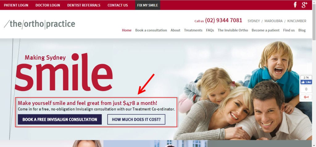
The best home pages use both primary and secondary calls-to-action to guide visitors to the next logical step in the process. For example they might say, “Fix My Smile” followed by “Book a Free Invisalign Consultation”, or “Book Now” followed by “Learn More”.
This strategy is designed to entice visitors to venture more deeply into your sales funnel, carefully holding their hand through each step so they do not get overwhelmed, disinterested or lost.
It turns your home page into an effective lead generation machine and not just a pretty design.
5. The magic of media mentions
Media mentions are a type of social proof. They clearly demonstrate that you are publicly accepted and praised by highly authorised sites. Media mentions are a great tool to boost trust and create a good first impression.
The higher authorised and relevant media sites you have mentioned, the better it is for your brand, especially when they refer to key value propositions that you want to build in user minds about your products/services.

Image 4: example of media mentions with excerpts that highlight key selling points
6. Your services sell better with raving reviews and testimonials
Many things contribute to a “book now” decision. Social proof, achieved through service reviews, is one of the more important things.
Research shows that “70% of consumers look at service/product reviews before buying” and “product reviews are twelve times more trusted than product descriptions from manufacturers.” Source: Fastmedical practice.com
[bctt tweet="70% of consumers look at product reviews before buying"]
For healthcare practices, you can use third party reviews widget and place it on your website.
7. Make your main products/services centre-stage
If you have multiple products/services to sell, ensure your main products and services are clearly featured first, with an invitation to users to explore further.
8. Videos are engaging, tantalising and powerful
Videos are more engaging than images, and they can be very powerful, if done well.
If you have a product/service that needs a bit of an explanation, for example, “eye bag removal procedure” or perhaps a demonstration of how some procedure works, having video will boost conversion.

Image 5: The use of video for dental practice is critical when it comes to explaining some difficult procedures such as dental implants
9. Clear Menu with About Us, Contact Us tabs
In the previous article about “12 Reasons Why I Won’t Buy From Your Website” I mentioned the vital importance of “About Us” and “Contact Us” pages.
You’d be surprised by how many users check your ‘About Us’ page. I used heatmaps to track users’ behaviours on our websites across 10 different industries and found that ‘About Us’ is one of the most visited pages on the website.
The ‘Contact Us’ page ranks almost on the same scale. Even if you run a healthcare practice from home, your website should have a phone number and email address for users to see and call, or email. Having a simple web form without any basic contact information looks transient and suspicious.

Image 9: Gordon Vet’s home page heatmaps
If you look carefully at this example, you’ll see the tiny little yellow dots on each of the menu items of the Gordon Vet Hospital website. These are heatmaps that show the most visited option is ‘About Us’ and ‘Our Friendly Staff.’
Users do actually want to know more about you, so showcase what you’ve got. If you have great staff, tell them. If you have high profile patient, let them know.

Image 10: Poor example of About Us page
This is a poor example of an ‘About Us’ page. It does not provide any ‘personable’ information. It doesn’t say who they are. It doesn’t say how they operate. If there was a heatmap indicating trust levels, and wouldn’t that be handy, this page would be colourless.
10. Optimise for multi-device usability
In the article about “3 SEO Changes For 2017 and What Businesses Should Do?” I highlighted the importance of mobile usability.
According to eMarketer, 2016 has seen mobile search reach the tipping point - the stage at which the majority of spend, organic traffic and paid clicks comes from smartphones and tablets, rather than the traditional medium of desktop and laptop search.

Image 11: Increasing search ad spending on mobile over time from 2013 to 2018
The home page should be able to instantly deliver exactly what users are looking for,when they are on mobile - phone number, contact info, value proposition, main services.
But do this with style. No one likes to wade through clutter to find what they are looking for.
On mobile, less is more. Keep it minimal.
11. Update your website with sensational new content
The best homepages aren't always static. Some of them, like Whitehouse.gov, constantly evolve to reflect the needs and questions of their visitors.
The success of any site to appear welcoming, relies on its ability to look as if there is someone at home. It needs fresh content that has recently been updated, or some sign that it has not been abandoned.
Testing and optimisation is a key component to a brilliant homepage web design.
12. Invest in good, professional photography
Generic photographs stand out a mile and they tend to leave a ‘generic’ impression. If you want to stand head and shoulders above your competition, invest in professional photography or in stock photographs that jump out of the page at you or create an emotional connection to the written content.

Image 12: Research by MDG Advertising has found that 67% of online shoppers rated high quality images as being ‘very important’ to their purchase decision. It ranked higher than ‘product specific information’, ‘long descriptions’ and ‘reviews & ratings’.
Poor quality photographs or photographs that have nothing to do with your message, are worse than having no photographs at all.
[bctt tweet="Get the full checklist in PDF to learn what to do and don't do on website home pages "]
13. Show that there are real and amazing people behind the scene
You can’t go wrong if you design your website according to the 1964 song People, by Barbra Streisand in “Funny Girl”, which says that “people who need people are the luckiest people in the world”.
People like to do business with people, not websites. Therefore don’t be shy about using images of your employees.
Melbourne Business School (MBS) tripled its media mentions by replacing a generic ‘Contact Us’ email and phone number on its media page, with a photograph and personal mobile phone number of each faculty member. It took six months to get the initiative approved due to privacy concerns, yet once the plunge was taken, no privacy or abuse incidents occurred.
When Marketing Experiments replaced a stock photograph of a call centre girl wearing a headset with the image of the founder, it increased conversions by 35%.

Image 13: Before the change of the image

Image 14: The replacement image of the popular business founder
14. Your design really matters
Good design is essential to build trust, communicate value and guide visitors to the next step. Check out your home page and give it the once over.
Conclusion
The days of passive websites are drawing to a close. The trend now is to get them working proactively. Good design is essential to build trust, communicate value and guide visitors to the next step. It’s the cornerstone of making your website an effective lead capture machine.
Download the simple checklist of dos and don’ts that I’ve put together for you and check out your home page now.
The sooner you start implementing this list, the sooner your medical practice can reap the benefits.
So what are the elements on Home Page that work for you? I’d love to hear more from you, please comment below. I am looking forward to it.
Hi, I'm Huyen
Our work (and this site) is devoted to sharing ideas, tools and resources that will help you automate, grow and scale your practice.
YOU MAY ALSO LIKE...
Featured Content
Categories
- Plastic Surgery Marketing
- Hair Transplant Marketing
- Conversion Optimisation
- Lead Generation
- Content Marketing
- Link Building
- Mobile SEO
- PPC
- Mobile Marketing
- Web Design
- Local SEO
- On-page SEO
- Social Media Marketing
- Grow & Scale Your Practice
- OMD Events
- Email Marketing
- Smart Marketing Advice
- E-commerce SEO
- TikTok Marketing
- Advertising Guidelines
- AI Automations


